Objective: Reimagining the Gulf International Bank (GIB) Private Banking identity to align with its exclusivity, sophistication, and client-first philosophy.
The Concept:
Rooted in elegance and simplicity, the rebranding exercise aimed to reflect the true essence of private banking: trust, discretion, and premiumness. A super minimal approach was adopted, blending gold for prestige and success with black for timeless sophistication.
Visual Identity:
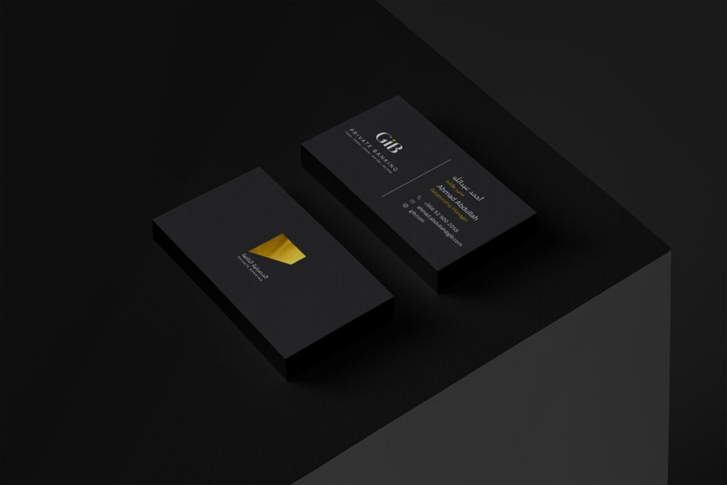
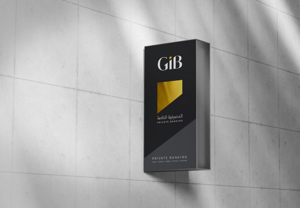
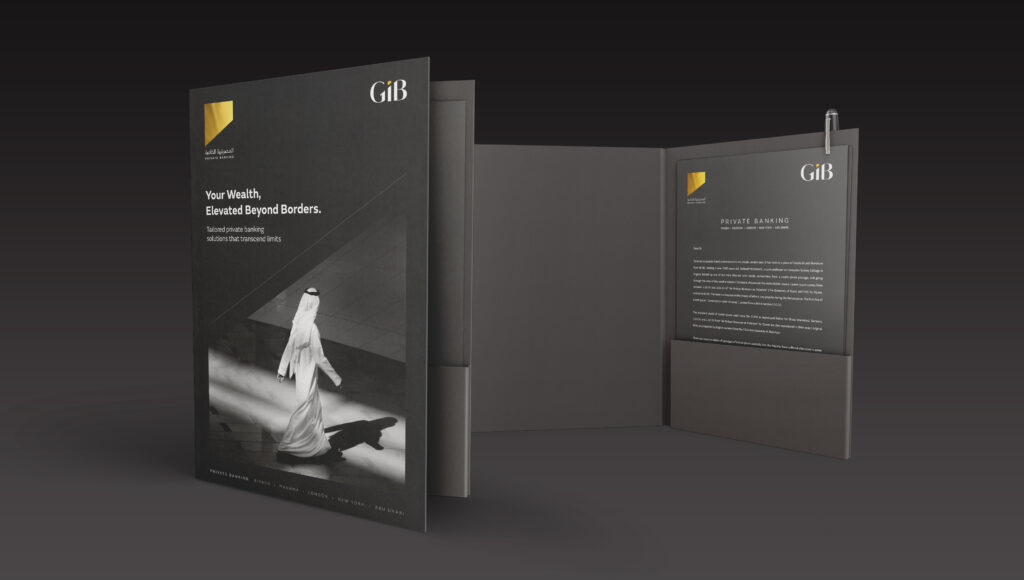
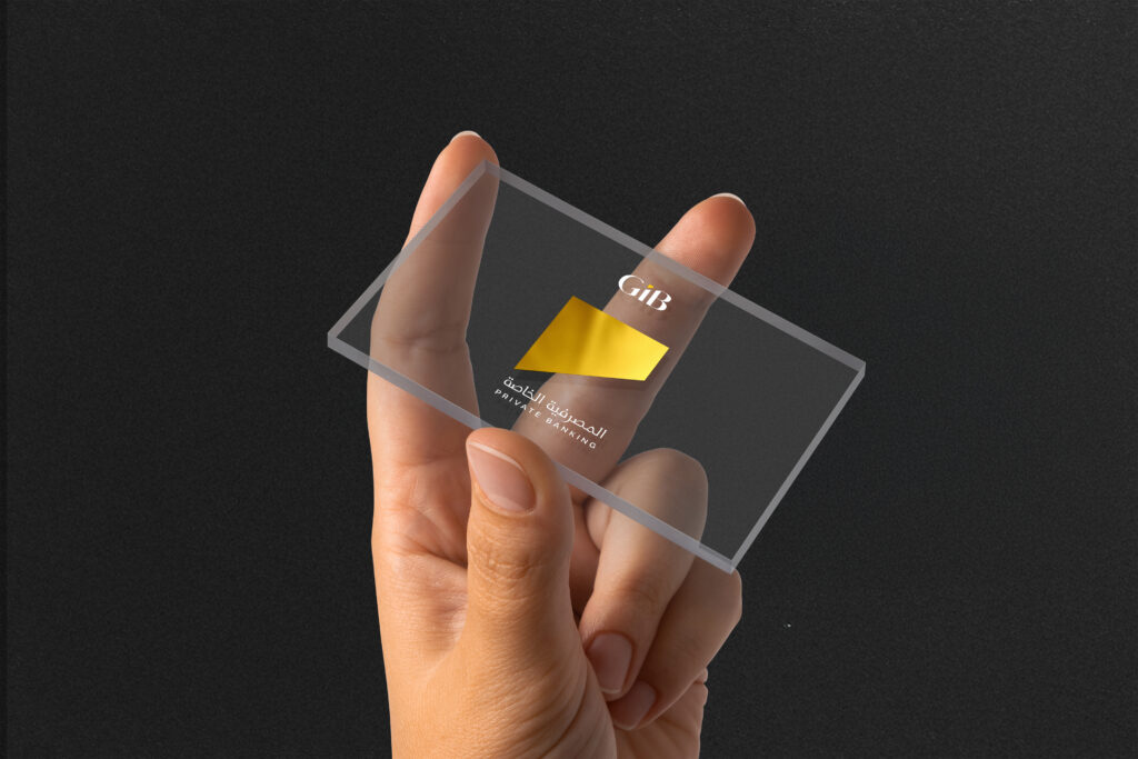
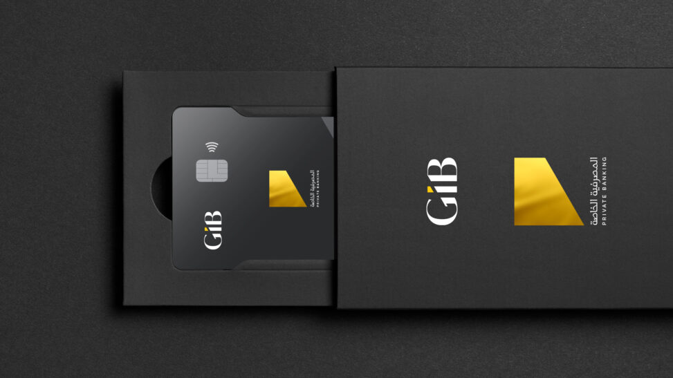
- Logo Refinement: A sleek, contemporary logo with precise lines and a restrained design. Gold detailing was used sparingly to evoke luxury without being ostentatious.
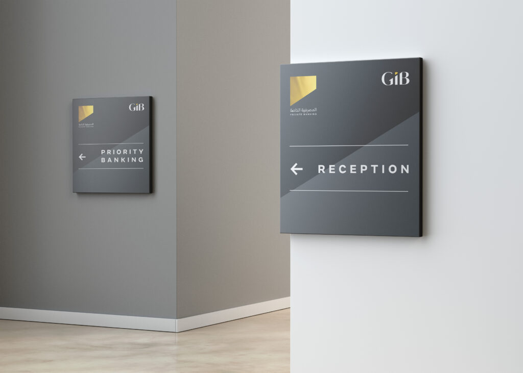
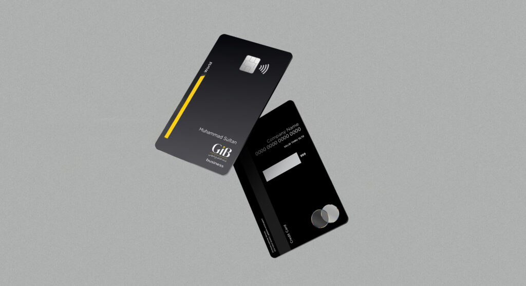
- Color Palette: Black as the dominant hue, representing strength and mystery, paired with subtle gold accents to signify prosperity and exclusivity.
- Typography: Clean, sans-serif fonts with impeccable kerning to communicate modernity, clarity, and confidence.
Applications:
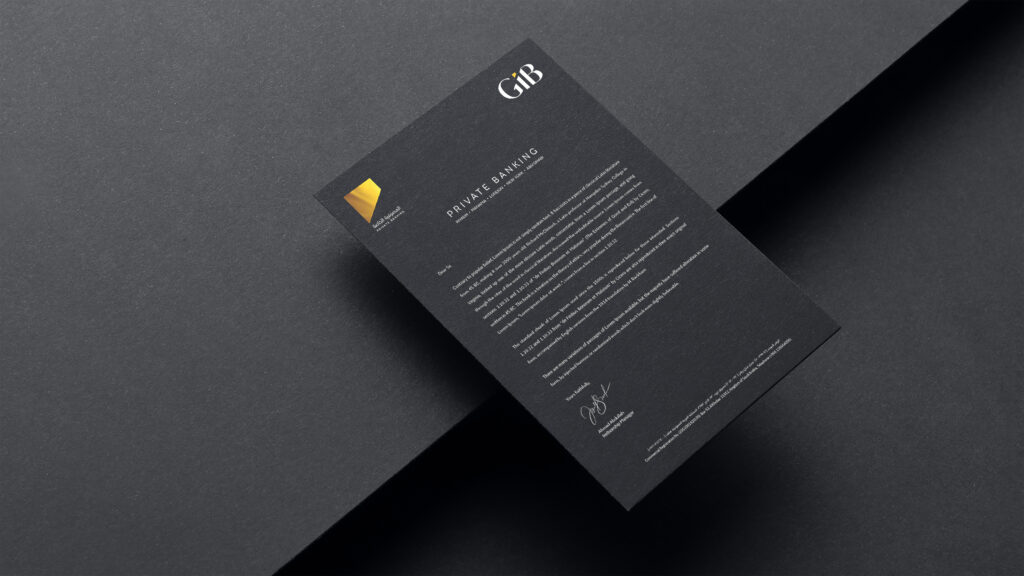
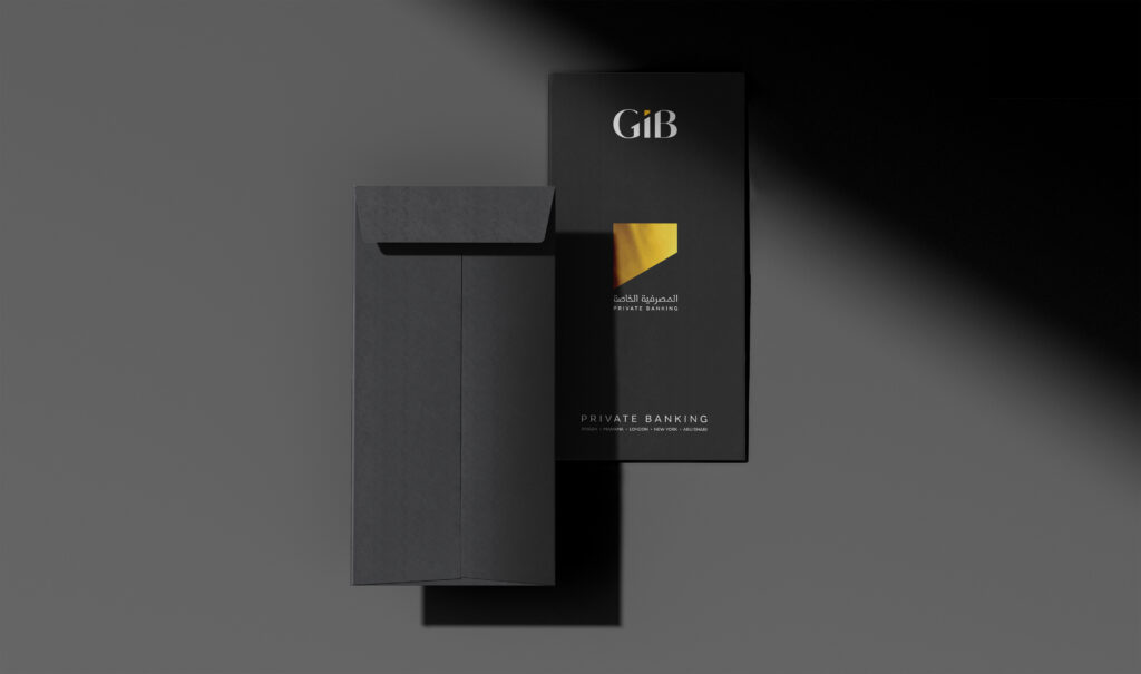
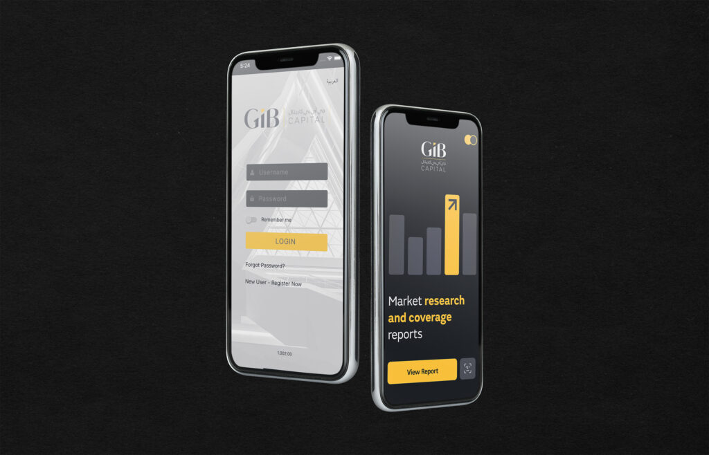
- Collateral Design: From bespoke leather-bound brochures to digital interfaces, the visual language remains cohesive and elegant.
- Client Touchpoints: Luxurious, minimal packaging for welcome kits, and a premium website with intuitive design reflecting the bank’s values of ease and trust.
- Branch Experience: Interiors that breathe luxury—a seamless blend of matte black elements, brushed gold finishes, and ambient lighting.
Tone of Voice:
Confident, polished, and intimate. Every communication—be it a client letter, a social media post, or a website banner—speaks directly to the refined tastes and high expectations of the clientele.
This rebrand positions Gulf International Bank Private Banking as not just a service but an experience of understated opulence.
